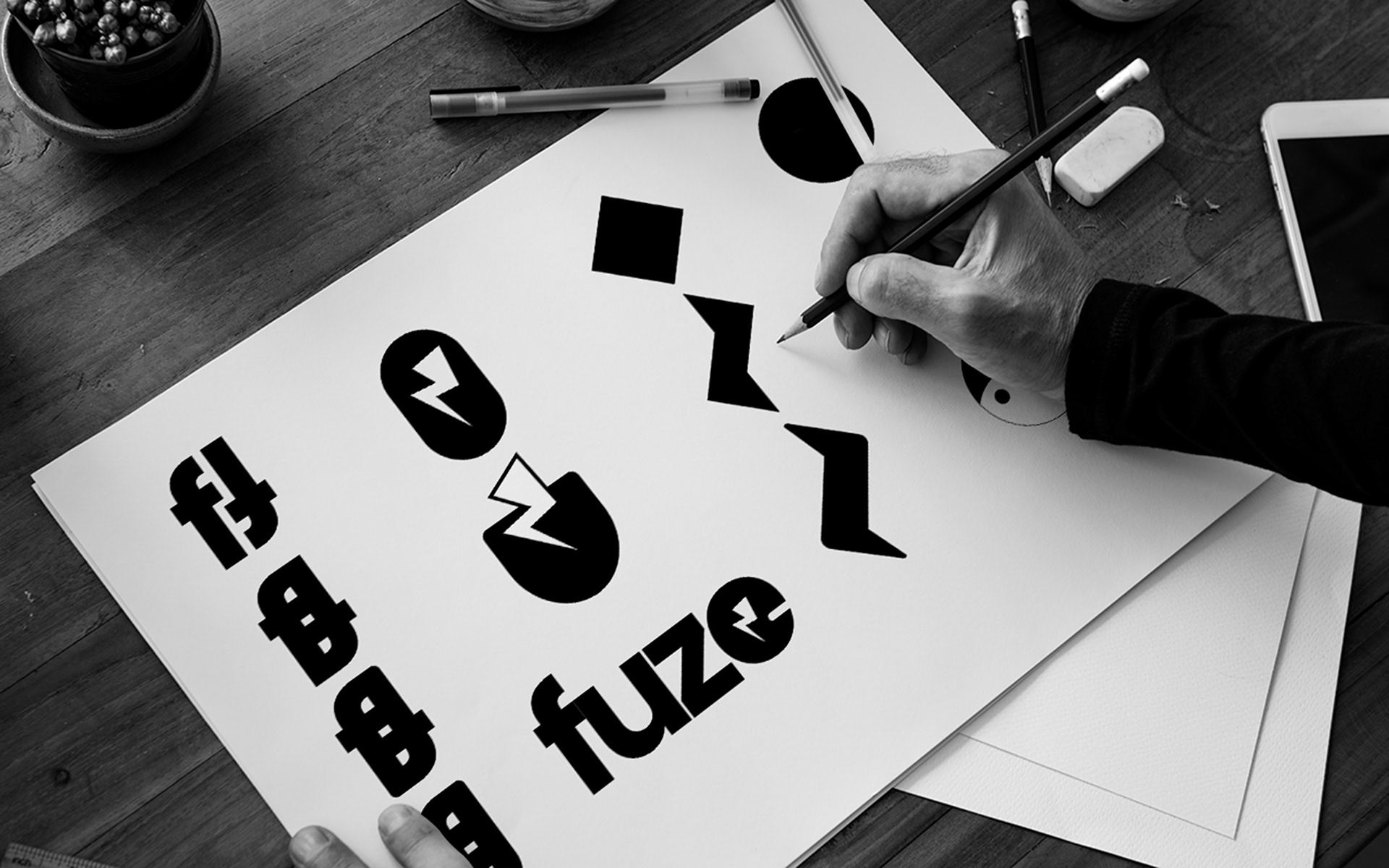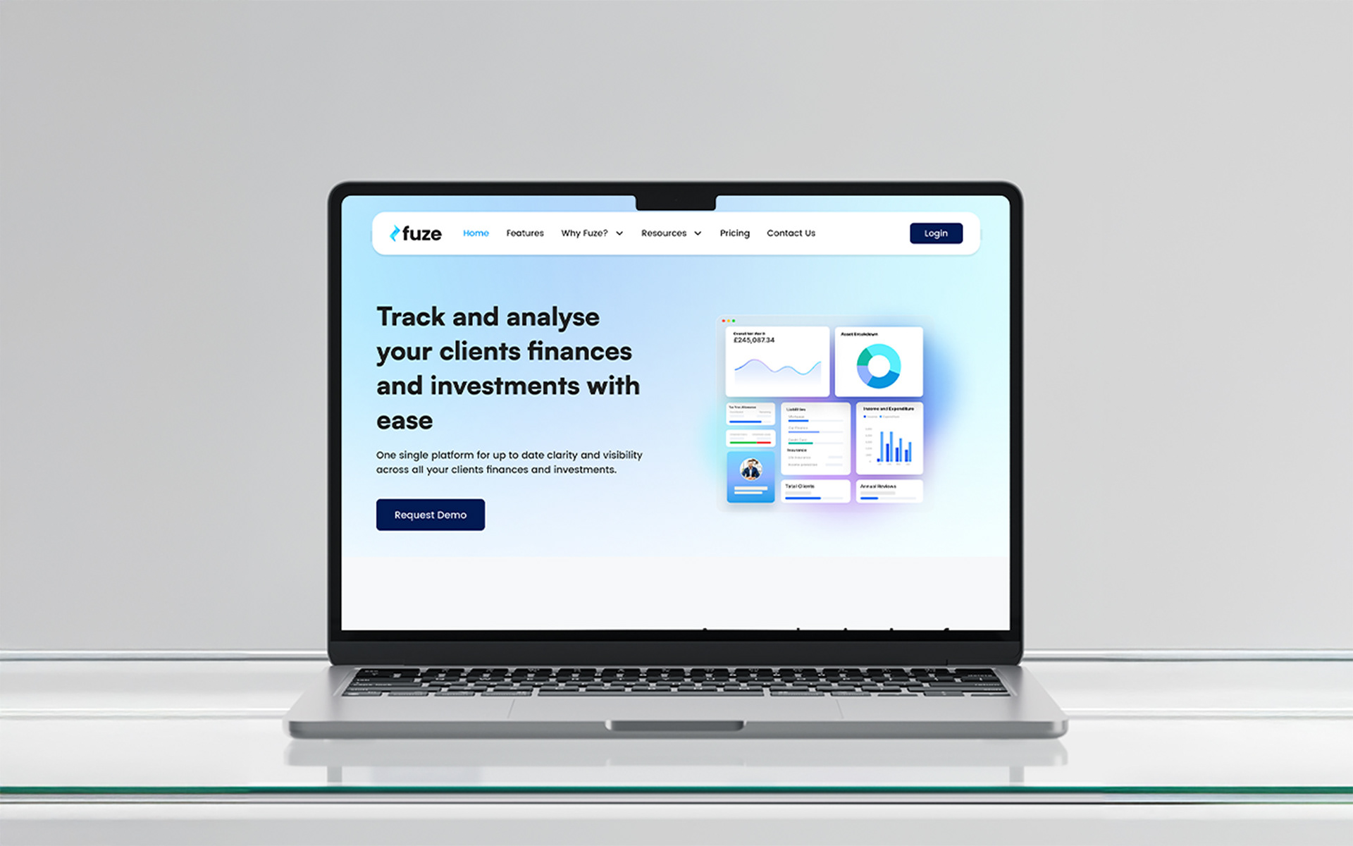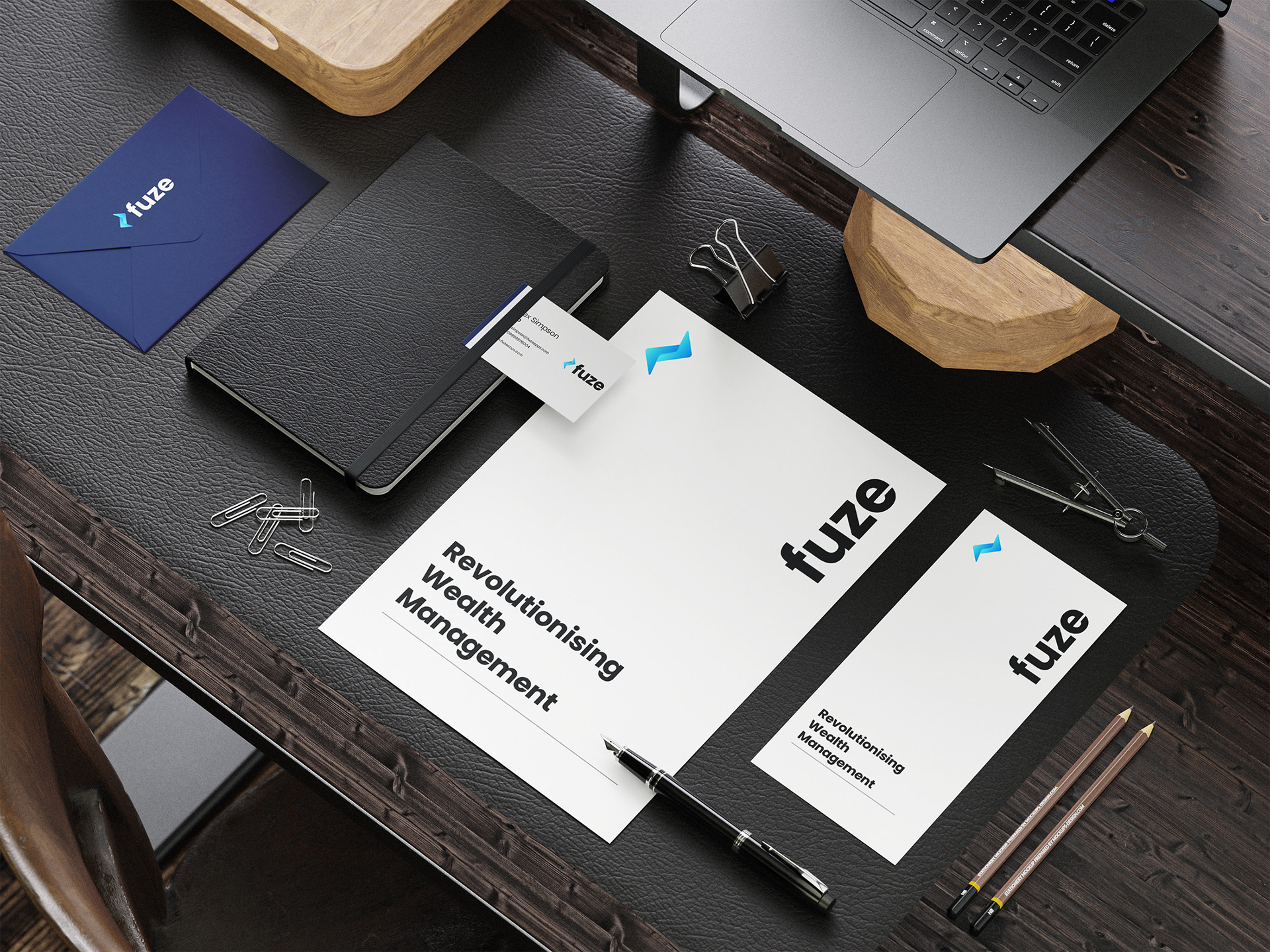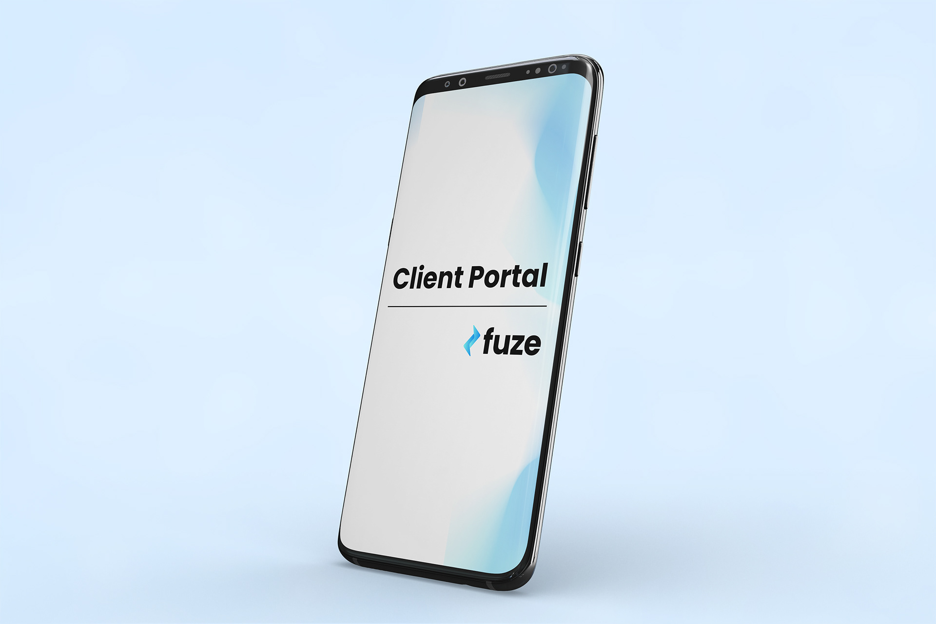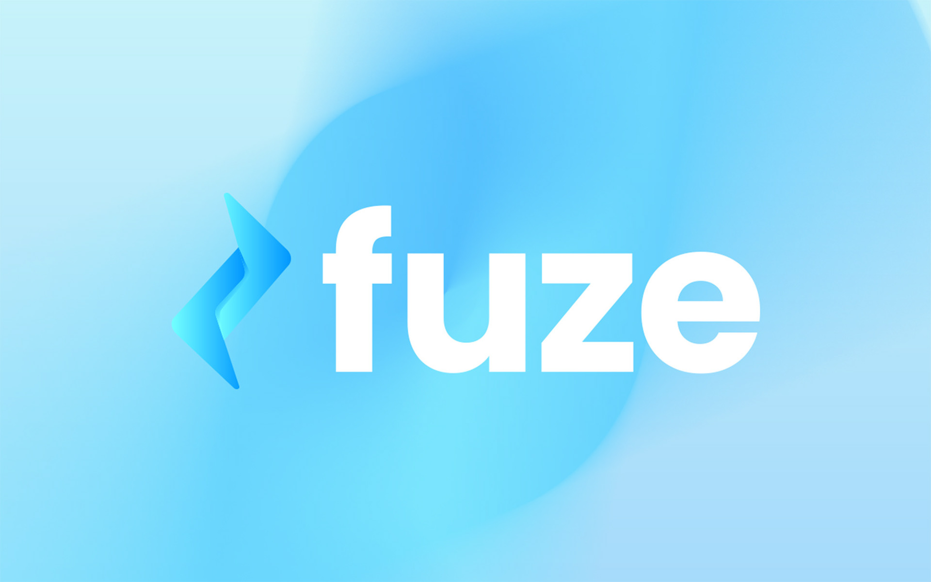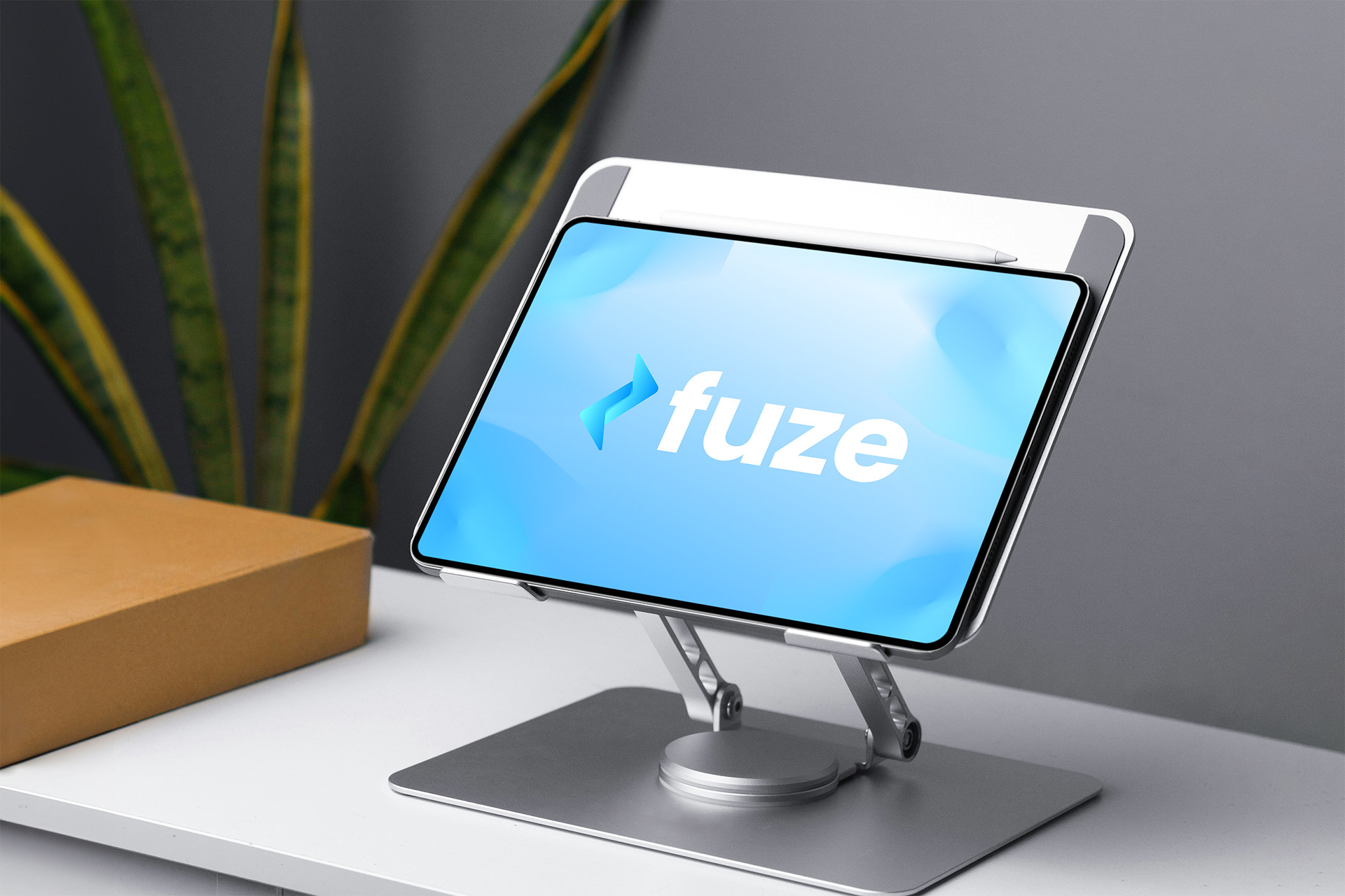
Fuze came to me as a fintech startup trying to look trustworthy without blending into the avalanche of blue logos and buzzwords in their space. So I built a clean, modern identity that actually means something. The logo fuses a lightning bolt with a yin-yang idea of balance — fast but controlled, powerful but calm. Paired with a crisp gradient system and secure typography, Fuze now looks like a company that has its act together and can move quickly without breaking things. In short: a fintech brand that feels effective, trustworthy, and serious about results.